I recently made a purchase on Amazon.in and couldn’t but wonder at their checkout process. Just too many clicks for comfort.
Here’s how it works at present
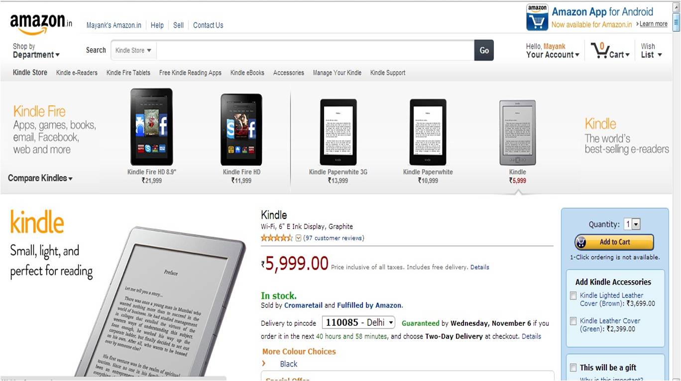
Step 1) Product Page
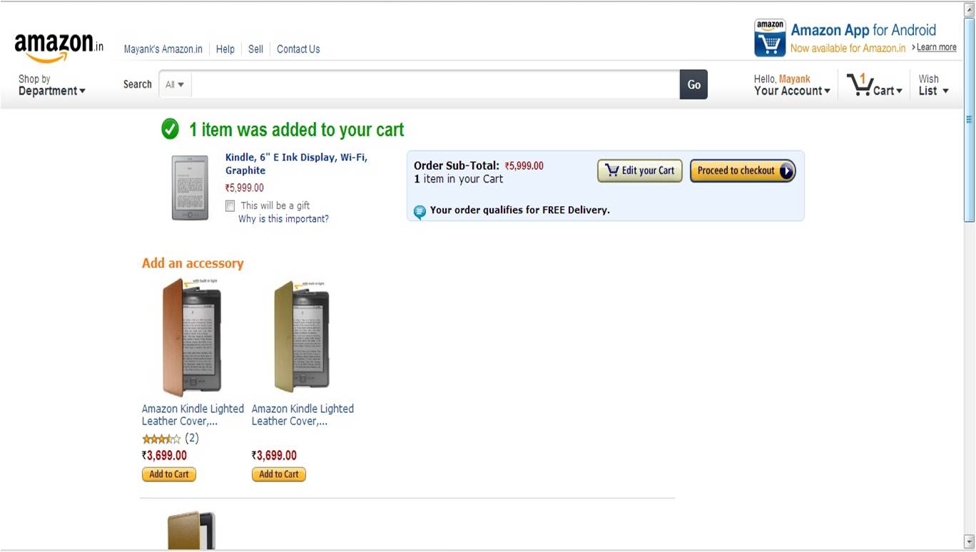
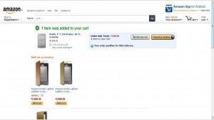
Step 2) Edit Cart or Proceed Page
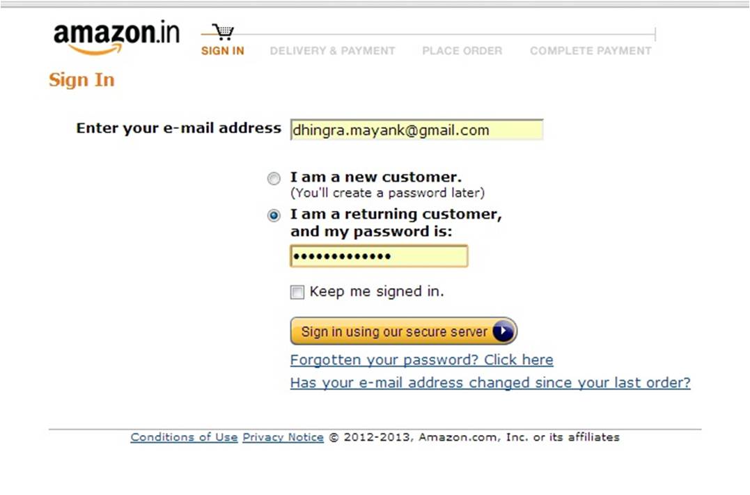
Step 3) Sign in/Sign up Page
Step 4) Delivery address Page
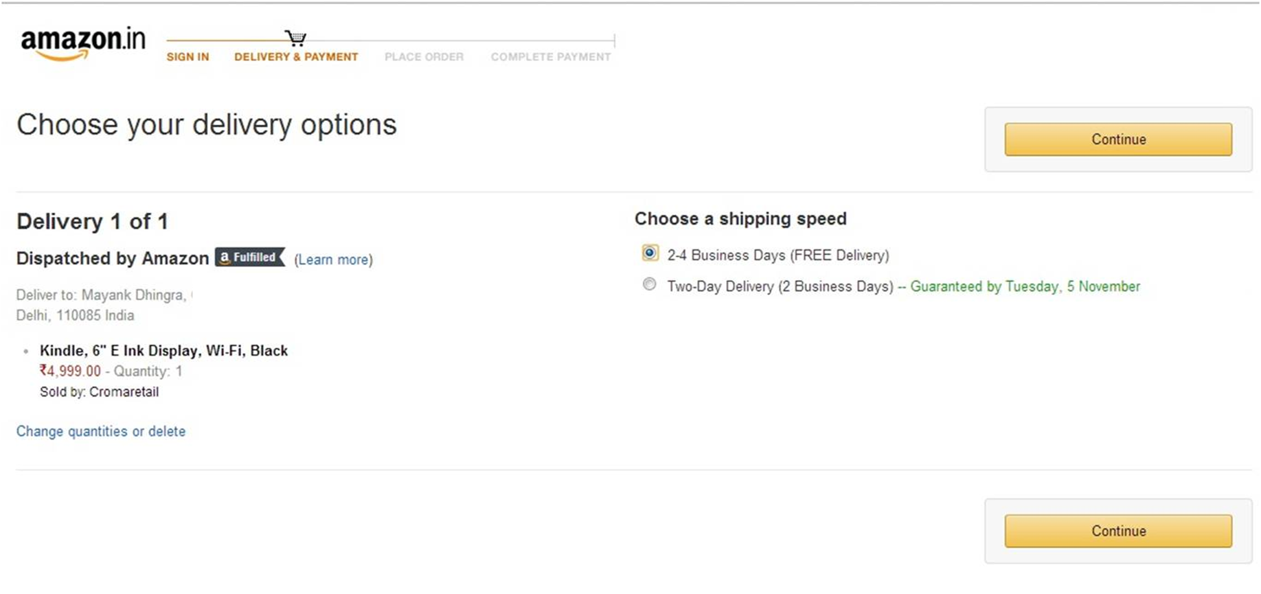
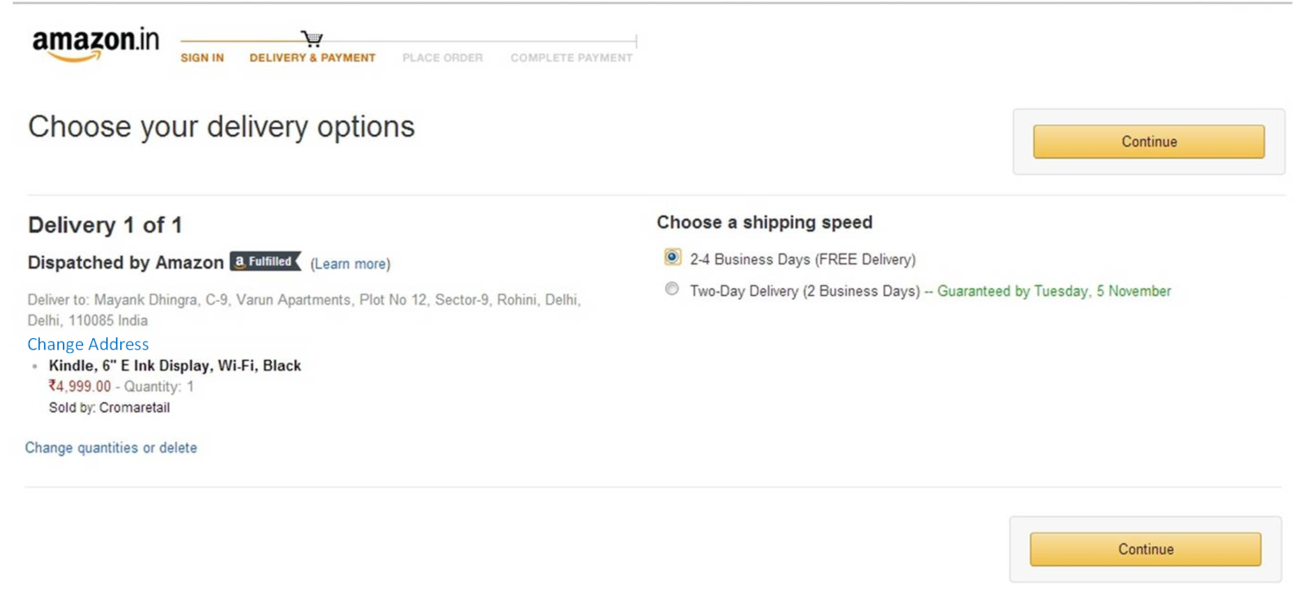
Step 5) Delivery options page
Step 6) Payment Method Page
Step 7) Review Order Page
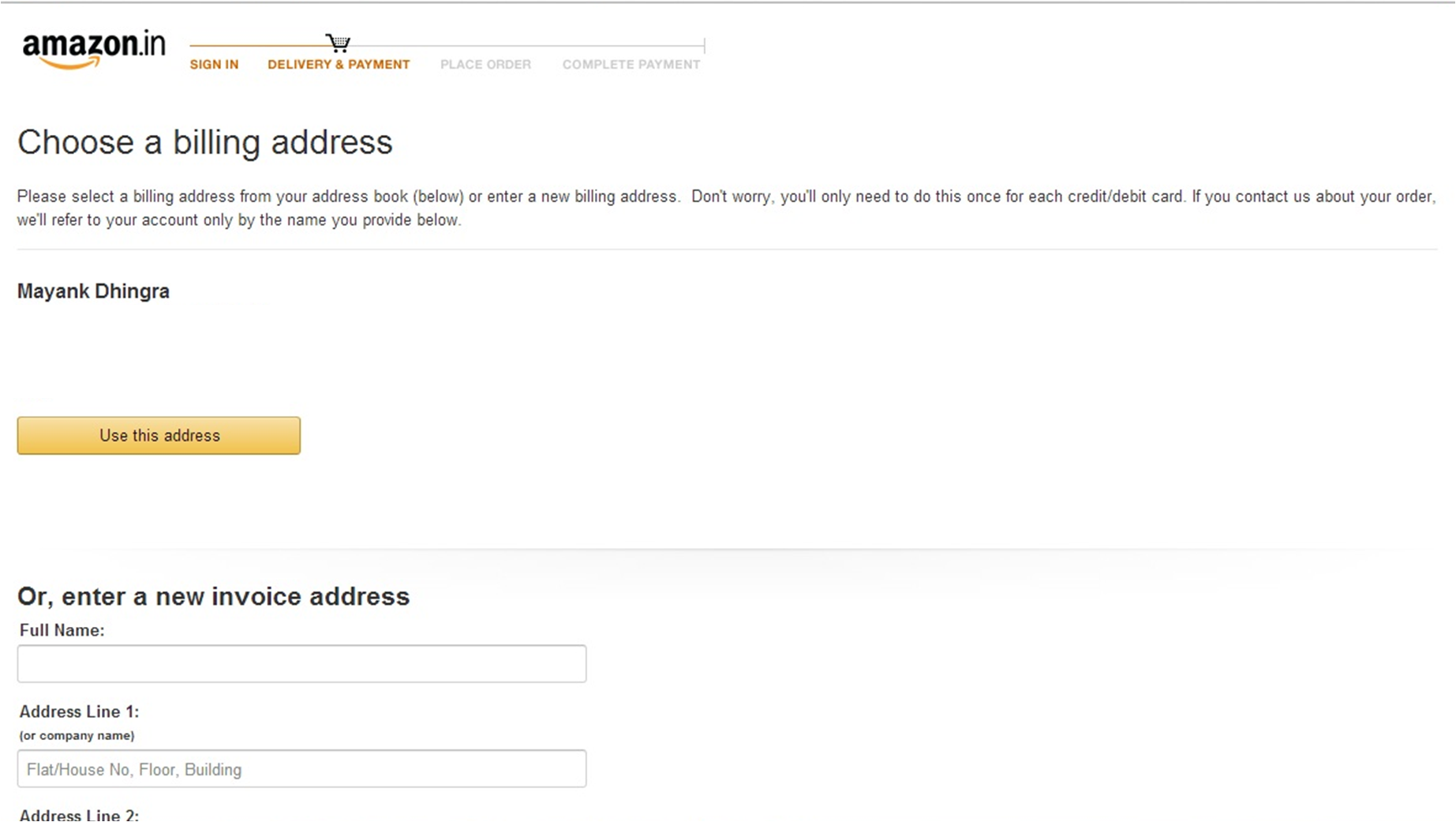
Step 8) Billing Address Page

Step 9) Order Completion Page
Phew !! With these many clicks Amazon is making sure that only the users absolutely committed to make a purchase are the ones who make one.
Nine steps to the order confirmation page. Wow. Let’s try to see if we can make things a bit better (less clicky)
- The easiest way around would have been to allow ‘1-click checkout’. Which for some reason isn’t available.
- Step 2: The importance of this page is to help those who want to review their cart. Not sure why would Amazon want people to doubt their purchase, unless they have over the period seen people change their cart contents during later stages of checkout or raised a of issues complaining of shopping wrongly.They should encourage users to add more items ala ‘Continue Shopping’ as it is popularly known or checkout. Ideally, however there should be an analysis of the % of people who buy 1 item vs % of people who buy multiple items. The experience should be made smoother for the majority case. It could just be a pop up and not a new page
- Step 3: Is an important one. Auto-saved credentials make things easier. I am not getting into the design of the page as in this case, it gets the job done in a single click
- Step 4 and 5 : I don’t really feel the need of having two separate pages for choosing delivery address and delivery options unless there are multiple addresses and options in question. The assumption here is most people would order to a single address. This could however be validated by data on median delivery addresses. Assuming most people will not change their address during the flow, I think in the step 5 there should be an option to change address without giving it a separate page.
UI could definitely be improved 🙂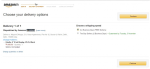
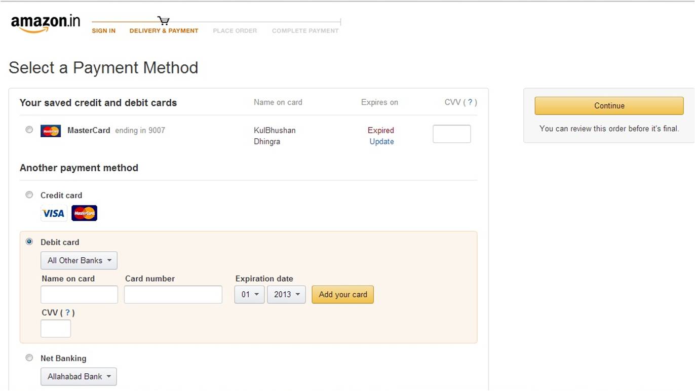
- Step 6: This is perhaps the most important page. The option of putting saved cards makes things easy. Just enter CVV and continue. The layout of other payment options is a discussion to be had another day
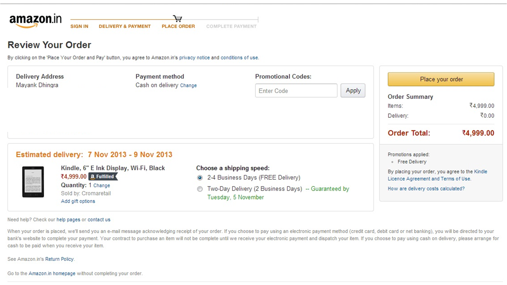
- Step 7: ‘Review Order’. Wait, why would I want to review order after putting my payment details? Shouldn’t this page come before the payments page? Step 7 should be Step 6. And Step 6 should be Step 7 with an option (selected by default ) “billing address to be same as shipping address”. An option to change billing address is going to be there of course. I simply don’t see a reason to have Step 8 “Choosing Billing Address” as a separate page.
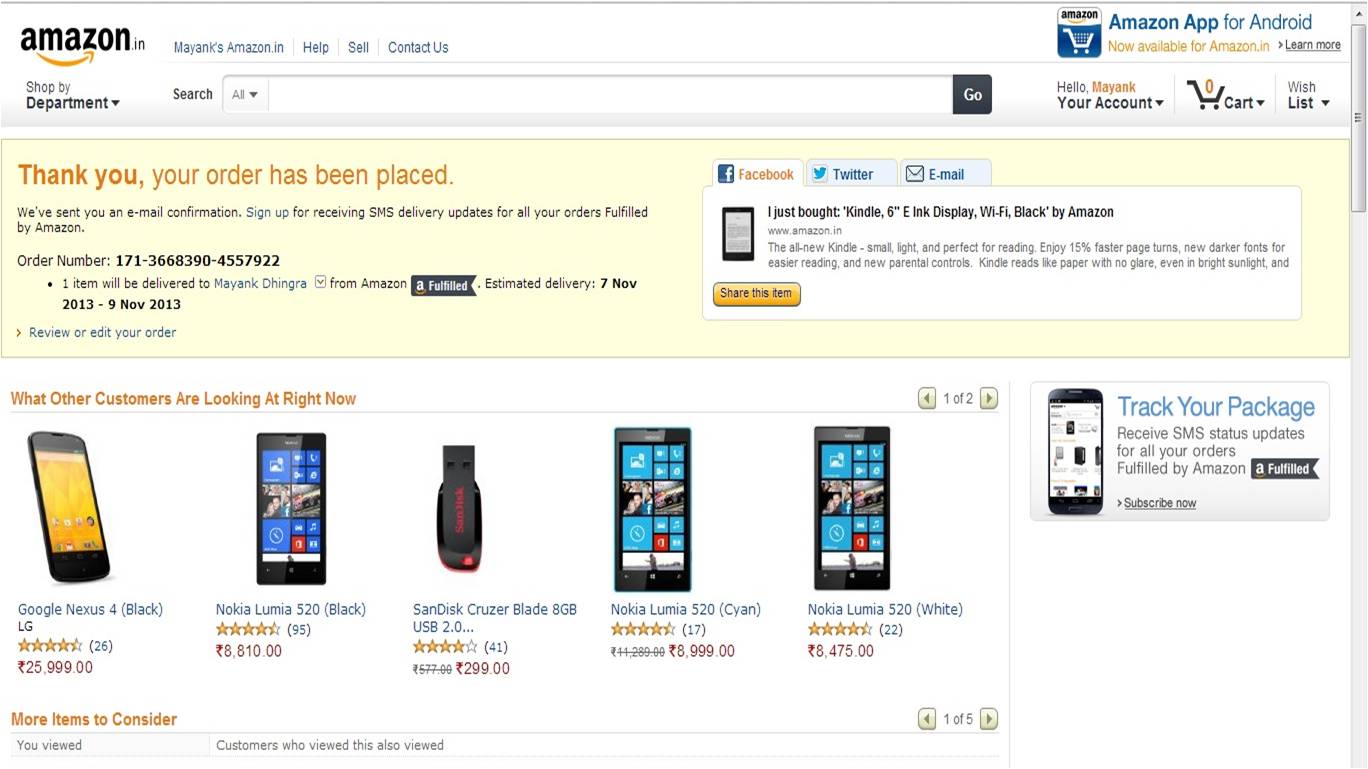
- Step 9: Order completion page. Informative and having some baits for users to view more items or make another purchase .So here’s the revised flowStep 1 (Product Page) – Page 1

Step 2 (Continue Shopping vs Checkout) to come as a popup on clicking Buy from product page and not a separate page
Step 3 (Sign in/Sign up Page)- Page 2 Step 4 (Delivery Address and Options Page) – Page 3
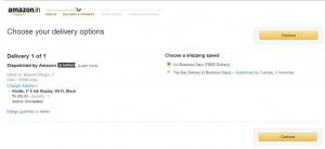
Step 5 (Review order page) – Page 4

Step 6 (Payments Page with Billing Address option) – Page 5
Billing address option could also be a part of the delivery address and options page. But in no case it deserves a separate page
Step 7 (Order completion page) – Page 6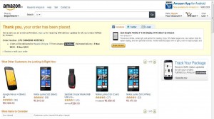
Though in the new order we are down to Six pages from Nine (33.33% lesser pages). I am sure this can be optimized by at least one more page by clubbing ‘Review Order’ and ‘Delivery Address and Options’ Page. For now 5 pages are good enough.Eventually a one click checkout for single product purchases is in order .
What do you think?


My friend, add some plugins for automatic logins like this blog here: http://bestengagingcommunities.com/
**You don’t have to publish this comment, it’s like an sms to you!
And seriously, I recently ordered a book from amazon, never noticed, teh steps were that many. Now that you mention it, seriously!! Amazon! Unbelievable.