Category Archives: usability

Reset Password Form

Forms are one of the most under appreciated elements of web design. Most interaction designers just won’t pay enough heed while designing them and thus the user frustration while filling all sorts of forms.

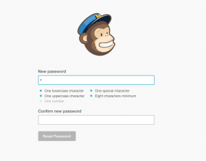
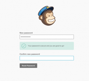
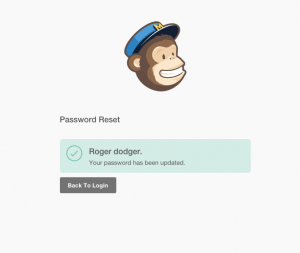
While using mailchimp I came across an interesting implementation of the password reset form so thought of sharing.

I’m not a fan of complex password policy, for obvious reasons

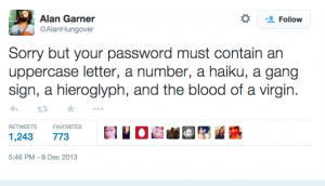
Password Must Contain

But, let’s say for some reason you need the password to match some criteria, this implementation works quite well towards

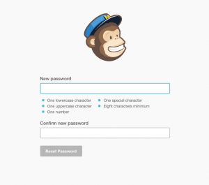
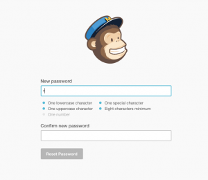
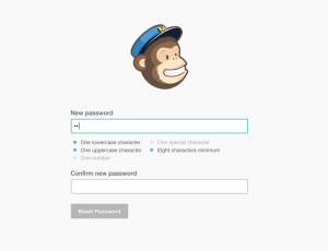
1) Communicating the exact requirements for a password
2) Active/real time feedback about which all conditions are met as user types the password


Screen Shot 2014-12-27 at 1.39.08 pm Screen Shot 2014-12-27 at 1.39.18 pm Screen Shot 2014-12-27 at 1.39.27 pm Screen Shot 2014-12-27 at 1.39.33 pm
Screen Shot 2014-12-27 at 1.39.53 pm Screen Shot 2014-12-27 at 1.40.40 pm

Twitter Android App: Beauty is in the detail

I’ve been a Twitter user for about 6+ years and have started accessing Twitter via their Android app a few months back. Not surprisingly my usage of Twitter has grown manyfold since I’ve moved from Tweetdeck to Android app, and frankly the reasons are obvious.

1) Great app
2) Continuous availability/access

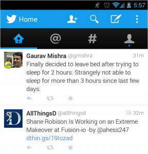
The android app for twitter is one of the most beautifully (think usability) designed apps. It has just the right buttons at the desired places, most intuitive functionality and easy on the eye. Here’s a little example of the nifty app’s detailing

Twitter Android App - Timeline

As you can see, the timeline view has app the possible things a user would want to do

General – Most Used (Excluding replies, discovery etc)

  1. Compose a tweet
  2. Search
  3. Follow someone

Pertaining to a tweet in Timeline

  1. Reply to a tweet
  2. Retweet a tweet
  3. Favourite a tweet

Now all these are great but an extra case comes for Retweets. Not only would I want to interact with the tweet but I might also want to follow the person whose tweets are being RTed

Timeline

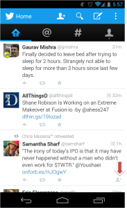
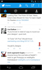
Yes, that little highlighted icon is what caught my attention. Here ‘Chris Messina’ who I follow, RTed a tweet from Samantha (whom I don’t follow). and Twitter’s app cleverly shows a tiny icon along these tweets which lets users follow the person whose tweets are being RTed. A quick click on this and you are done

Follow the RTed person

That’s a nice example of putting relevant features beautifully without affecting the user experience. I’d love to talk more about the app sometime.

Analyzing Amazon.in Checkout Process

I recently made a purchase on Amazon.in and couldn’t but wonder at their checkout process. Just too many clicks for comfort.
Here’s how it works at present

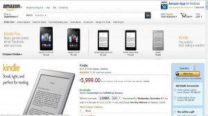
Step 1) Product Page 

Product Page - Amazon.in


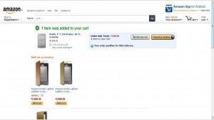
Step 2) Edit Cart or Proceed Page

Edit Cart or Proceed - Amazon.in


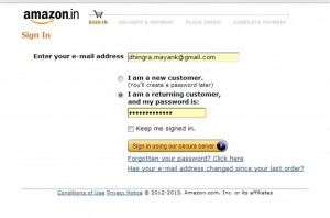
Step 3) Sign in/Sign up Page

Login/Sign up Page - Amazon.in


Step 4) Delivery address Page

Delivery Address - Amazon.in

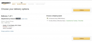
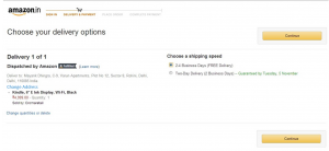
Step 5) Delivery options page

Delivery Options - Amazon.in

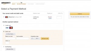
Step 6) Payment Method Page

Payment Method Page - Amazon.in


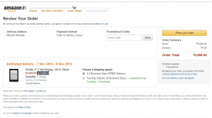
Step 7) Review Order Page

Review order page - Amazon.in


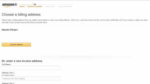
Step 8) Billing Address Page

Billing Address Page - Amazon.in


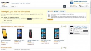
Step 9) Order Completion Page

Order Completion Page - Amazon.in


Phew !! With these many clicks Amazon is making sure that only the users absolutely committed to make a purchase are the ones who make one.

Nine steps to the order confirmation page. Wow. Let’s try to see if we can make things a bit better (less clicky)

  1.  The easiest way around would have been to allow ‘1-click checkout’. Which for some reason isn’t available.
  2. Step 2: The importance of this page is to help those who want to review their cart. Not sure why would Amazon want people to doubt their purchase, unless they have over the period seen people change their cart contents during later stages of checkout or raised a of issues complaining of shopping wrongly.They should encourage users to add more items ala ‘Continue Shopping’ as it is popularly known or checkout. Ideally, however there should be an analysis of the % of people who buy 1 item vs % of people who buy multiple items. The experience should be made smoother for the majority case. It could just be a pop up and not a new page
  3. Step 3: Is an important one. Auto-saved credentials make things easier. I am not getting into the design of the page as in this case, it gets the job done in a single click
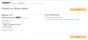
  4. Step 4 and 5 : I don’t really feel the need of having two separate pages for choosing delivery address and delivery options unless there are multiple addresses and options in question. The assumption here is most people would order to a single address. This could however be validated by data on median delivery addresses. Assuming most people will not change their address during the flow, I think in the step 5 there should be an option to change address without giving it a separate page.
    UI could definitely be improved 🙂Delivery Address and Options Page - Amazon.in
  5. Step 6: This is perhaps the most important page. The option of putting saved cards makes things easy. Just enter CVV and continue. The layout of other payment options is a discussion to be had another day
  6. Step 7: ‘Review Order’. Wait, why would I want to review order after putting my payment details? Shouldn’t this page come before the payments page?  Step 7 should be Step 6. And Step 6 should be Step 7 with an option (selected by default ) “billing address to be same as shipping address”. An option to change billing address is going to be there of course. I simply don’t see a reason to have Step 8 “Choosing Billing Address” as a separate page.
  7.  Step 9: Order completion page. Informative and having some baits for users to view more items or make another purchase .So here’s the revised flowStep 1 (Product Page) – Page 1
    Product Page - Amazon.in
    S
    tep 2 (Continue Shopping vs Checkout) to come as a popup on clicking Buy from product page and not a separate page
    Edit Cart or Proceed - Amazon.in
    S
    tep 3 (Sign in/Sign up Page)- Page 2

    Login/Sign up Page - Amazon.inStep 4 (Delivery Address and Options Page) – Page 3

    Delivery address and options page - Amazon.in

    Step 5 (Review order page) – Page 4

    Review order page - Amazon.in
    Step 6 (Payments Page with Billing Address option) – Page 5

    Payment Method Page - Amazon.in
    Billing address option could also be a part of the delivery address and options page. But in no case it deserves a separate page

    Step 7 (Order completion page) – Page 6

    Order Completion Page - Amazon.in
    Though in the new order we are down to Six pages from Nine (33.33% lesser pages). I am sure this can be optimized by at least one more page by clubbing ‘Review Order’ and ‘Delivery Address and Options’ Page. For now 5 pages are good enough.

    Eventually a one click checkout for single product purchases is in order .

    What do you think?

App Review – Thrill

Despite all the jig bang the Indian cyber space has kinda been hostile to the incumbents of online dating ecosystem. Dating as a concept is yet to catch up here but some of the newly launched mobile apps seemed determined to change that.

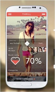
Thrill, is one such new dating app on the block ( H/T @pacificleo). Android based and targeted for Indian users.

Thrill App


Founded in Nov 2012 in Singapore by Josh Israel and Devin Serago. The USP of the app is that on Thrill, women have the absolute power to decide which guys to accept and reject.”He applies. She decides” goes the tagline

Apparently women in a man’s network have to approve for him to be able to join. Not sure, how it is actually implemented though

Let’s check out the app

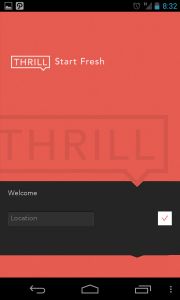
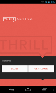
1) Welcome Screen

Welcome Screen


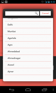
2) Choose Location
Choose Location

The metros figure up on top of the list followed by other cities arranged alphabetically. Good thing

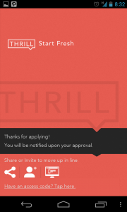
3) Apply & Wait

Apply & Wait


Thrill isn’t an open platform (at least it wasn’t when I used it for the first time last month). You apparently are placed in a queue to verify your profile and make it look exclusive. A social share in hopes of moving up the queue is a bonus.  I didn’t share socially but got an approval in a day or so

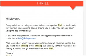
Thrill Approval Email


We will only connect you both if the feeling is mutual


4) Gender Selection, Sign up and Social profile Access

a) Gender


b) Sign up


c)

Access


Three screens to select gender, choose sign up via social profile and then grant access is an overkill.

Possible Alternatives:

Show screen 4b) first and add profile access disclaimer there itself. Ask for gender only if the user hasn’t filled in their gender in their profile.

Also, WHO/WHY would anybody sign in with their Linkedin Profile on a dating app? I’d be really interested in knowing what % of signups happen through linkedin. (Use Twitter or Google instead)

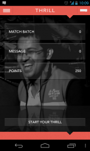
5) Dashboard

Dashboard

Comments: As a first time user, I have no clue what a “Match Batch” is and what’s the deal with “Points”. Anyways, I’d click “Start Your Thrill” as the call to action is quite powerful.

6) Starting Thrill

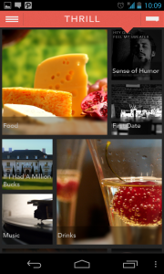
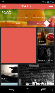
a) Select Category

Starting Thrill


Comments: This screen isn’t that intuitive, some overlays would help a newbie figure out how to go ahead.

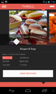
b) Rate Category

Rating a category bit didn’t seem needed and also added an unnecessary extra step in the flow

Category
c) Rate Item

Rate item
After rating a few items you get an option to view matches.

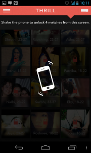
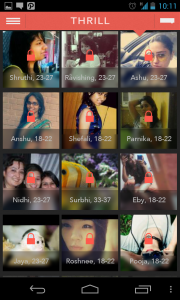
7) See Matches

shake to unock


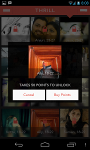
See matches


Based on how you rated various items you are presented an unlock batch of matches, you can unlock some of them initially by shaking your phone or eventually by buying credits (Freemium mode #goodone)

Buy Points
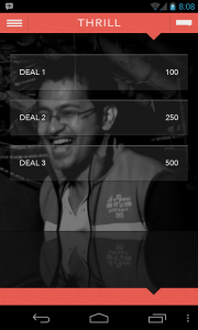
Deals

This page where the user is supposed to choose how many points do they want to purchase isn’t quite clear. I am not sure if Deal 3 is for 500 points or 500 Rs. Also, some help on how much is 1 point for, and a few basic FAQs  in form of a link etc would be of appreciated.

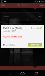
Payment


Phew !!

Overall the app seems to be very neatly designed(UI and UX), is fairly fast and has an interesting  take on dating. The concept of rating various categories and items in them to be able to find a matching profile is fairly intuitive.

Initially it had some bugs (app freezing or crashing during certain events) which were fixed in subsequent updates.

I haven’t used dating apps so don’t really know what the ideal/expected scenario is. Do users keep using the app actively or they find a match or two and leave?

Apart from the extended workflows required for certain actions I am apprehensive on how would they solve the

  1. Should the part of rating be one time during on-boarding or a regular affair? For example if have I rated all food items, is it done or after some time there will be new items which I’d be required to rate to be able to find new set of matches? Perhaps the core experience could be made simpler and an easy win given to the user
  2. Chicken and Egg problem : Despite giving the app a spin for a few weeks, the overall user base didn’t seem to be increasing much. There is no way to know if more and more women are joining the app. I think unless this is the case or you find a match early one, I am not too sure why would someone keep coming back to the app.


Customer On boarding- 3/5
Engagement -2/5
Look and Feel – 4/5

Overall Rating:  3.5/5


The Design of Everyday Things: PVR’s movie schedule

If you’ve been to a PVR cinema ever you might remember their movie schedule. Here’s a screenshot for your reference (sorry for the low quality picture).

pvr cinemas movie schedule

Did you notice anything?
The listing/sub-section for PVR cinemas in South Delhi looks exactly like the subsection for West Delhi. Exactly my point.

Every time I pick up this schedule I invariably feel there’s something wrong about its design and the problem is that it’s really a pain to find out where the theatre in question(the one(s) you want to check) is located in the schedule i.e. Unless you’ve ingrained the complete  movie schedule layout in your head you will have to spend time locating the cinema of your choice (middle right or left bottom or extreme right top) and the PVR guys haven’t helped us a bit with this problem. Their approach is simple, list all the PVR theatres in NCR, categorize them according to locations, put them class wise (PVR Premiere on Top) and mass print it for each of these theatres.

While this might sound obvious(and most easy) way to go about this situation, it certainly isn’t the best (it takes some time to locate your theatre of choice) and many of you might agree that folks at PVR could do a better job at it by customizing their schedules a bit.

Wouldn’t it be nice for them to print 5-6 different schedules for various regions (North Delhi, South Delhi, Gurgaon etc) if not for all theatres and highlight the show timings for each one of them (for ex: the movie schedule for North Delhi has first/top most space for North Delhi cinema listings)?

What say?
Designing Notification Emails: What you can learn from Friendfeed and others

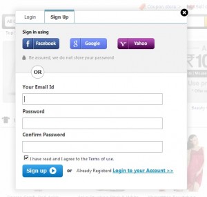
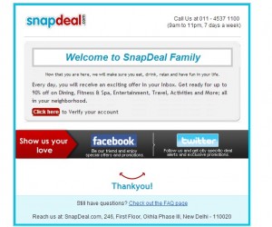
Email notifications for various actions(like new friend request, new follower) play an important role in getting a user back to the site and making them perform an action (accept/deny or follow back). Also, given the huge size of various social networks and thinking of these emails as a customer touch point it’s helpful to have a nicely designed notification email template. I’ve written a couple of posts on the same earlier too.

In this post I’ll try to compare the notification email by various popular platforms for the basic action of getting a new friend,follower, subscriber etc and see whose doing what and what could they do to make things better.

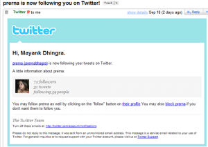
1) Twitter:


Format: HTML; Display Pic: Included; Call to Action: Visit profile; Direct Action: Block

This template is mostly good enough to decide if a user wants to follow back another user of not but by having a direct follow button would have helped.

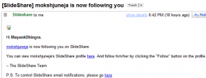
2) Slideshare


Format: HTML; Display Pic: Not Included; Call to Action: Visit profileDirect Action: None

This template is plain and simple but it doesn’t have a display pic for new follower and it doesn’t have a direct button for an action. Also, it has two links which point to the same page, which isn’t the best thing .

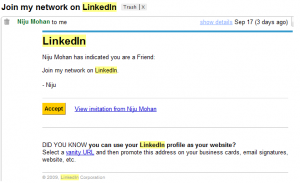
3) LinkedIn

Format: HTML; Display Pic: Not Included; Call to Action: View InvitationDirect Action: Accept Invitation.

While Linkedin has a direct action button they don’t have any detail about the user in question. Here again a picture or some more description will be helpful.

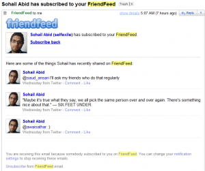
4) FriendFeed:

Format: HTML; Display Pic: Included; Call to Action: NoneDirect Action: Subscribe back

Friendfeed has by far the best designed email notification template in which they have the display pic, last few updates and just one link to get direct action(subscribe back) from the user

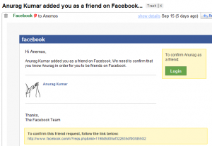
5) Facebook:


Format: HTML; Display Pic: Included; Call to Action: Visit request Direct Action: Accept Request.

Facebook has changed it’s notification from the older one (active till 14th september 09). While they have definitely gone the Friendfeed way, the name  of direct action button is Login which doesn’t kinda look right.

Format: Text; Display Pic: Not Included; Call to Action: View RequestDirect Action: None

6) Orkut:


Format: HTML; Display Pic: Included; Call to Action: Visit profile and Visit friends pageDirect Action: None

Orkut too like slideshare has two links to the user’s profile and a third link which reads ‘visit friends page’ but it takes you to a separate ‘add friends’ page ala facebook.  Also there is no direct call to action here too.

While there could be reasons for not having a direct action button for Facebook and  Orkut(because they need to group friends into categories for example) some sites like Slideshare and Twitter can easily pick this.{Tip 1}

Having two links to the same profile page is definitely not wise and needs to be taken care off {Tip 2}. Other tips like having some profile info and a display picture can help {Tip 3} in a direct call to action(button etc) {Tip 4} if there is.

As you might have noticed eventually every notification email has moved to HTML format as it has more options like better looks and including a direct action call. {Tip 5}

What do you think about these email notifications?
Want to download a file from Scribd? Upload one – Part II

A couple months back I wrote about an interesting(weird?) feature of Scribd that asked me to upload a file in order to let me download another. I wasn’t the only one who found this ridiculous (read comments) and obviously it didn’t go down well with some of us. I happened to run into that feature (which I had almost forgot) again while trying to download one of the featured documents from the site. Here’s what I got after clicking the download link

scribd_presentations need an audience

Oh, so instead of a boring textual message we now have a graphic trying to convince us that in the benefit of community we should upload more presentations. I like most other users(presummably) on the internet didn’t let this deviate it from the goal I started with and clicked “Maybe Later” but folks at Scribd were equally adamant in not letting anyone download something from their servers without getting anything in return (who needs Attention, Engagement etc?) so I got this

scribd_subscribe or continue to download

Right, So if I am not uploading a file I might as well follow(or subscribe) to some people which Scribd feels match my needs(or their’s ?). For a second I can understand the upload presentations prompt, but prompting users to SUBSCRIBE to other users when all they really want is to download a goddamn presentation ?

O Scribd, what were you thinking ?

Apparently there’s another graphic that one gets to see while attempting to download a presentation

scribd_giving back to the community

Thankfully unlike last time Scribd has not only made it optional(maybe later) to upload a presentation before getting to download, they also tell you that you won’t be prompted to upload once you’ve uploaded two presentations or more.

scribd dont worry

(Footer of those upload prompts)

As mentioned in last post I don’t think that forcing users like this works well. Not only does it irritates users it also leads(or might lead) to people submitting random garbage just to get around the needless hurdles like these.

What do you think about these prompts?

Is there a win-win solution for such situations (for both site owners and users) ?

Slideshare: Follow or Add as a contact ?

Got a mail from Slideshare notifying about a new follower. Curious, I opened the email and here’s what I saw.

slideshare new follower mail

If you haven’t noticed what I mean, there are two different terms being used to represent an action i.e. Follower and Contact. While the subject reads ” lindamoodbell is now following you on Slideshare” the very first line in email reads “lindamoodbell added you as a contact on Slideshare”.

So is lindamoodbell following me on Twitter oops Slideshare or has she added me as a contact ? And if they mean the same thing why are these terms loosely used for each other?

Interestingly the email also mentions that I can too add her as contact on Slideshare(no mention about following her back)

I wrote about the changes from term contact/friend etc to follower in both Scribd and Slideshare here and mentioned how exisiting users might find these changes in terminology confusing. A look at lindamoodbell’s page on Slideshare confirms this.

slideshare profile page

Not even a single mention of word follow/follower by users. While Slideshare might want its users to follow each other, its users seem happy adding each other as just contacts.

What do you think about these changes ?