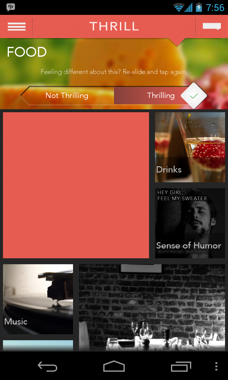
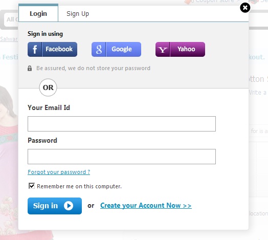
Was reading this great post on Showing Passwords on Log-In Screens by the awesome @lukew and thought of checking how various apps (Indian and Global) that I use are handling their login/sign in page, thus this post. Also, notice which apps use login and which use “sign in”
1) Facebook – Log in
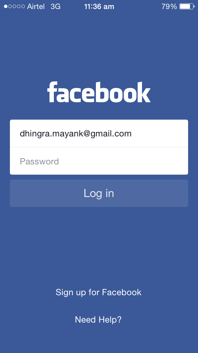
Neat, Minimalistic and incredibly simple.
No of buttons on page = 1, No of input fields = 2, No of links = 2
Option to see password – No
Also, notice how they say “Need Help” instead of the typical “Forgot Password” option used by almost everyone
2) Cleartrip – Sign in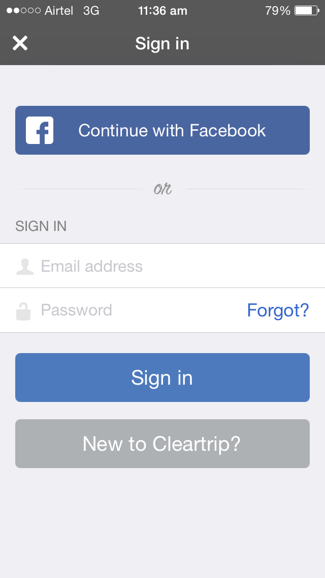
A bit cluttered
No of buttons on page = 3, No of input fields = 2, No of links = 1
Social Login Options: 1
“Continue with Facebook”?, that’s a rather different(vague?) copy for a login with Facebook option.
Option to see password: No
3) Uber – Sign in
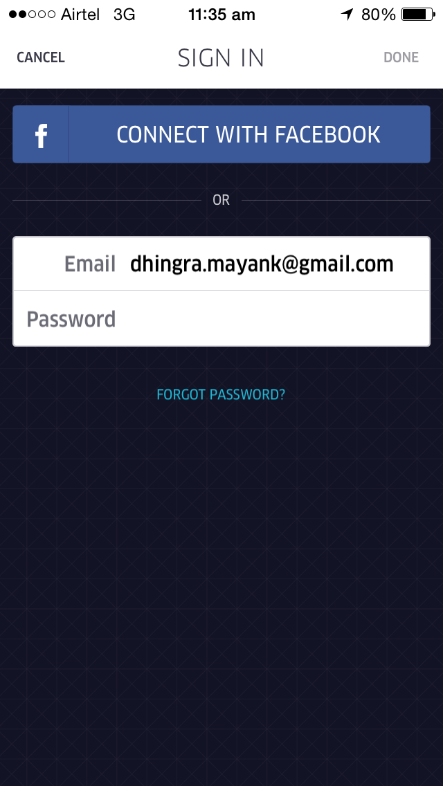 With no branding, it’s impossible to guess which app is this.
Minimalistic and Neat
No of buttons on page = 1, No of input fields = 2, No of links = 1
Interestingly they don’t have a button to Login, only an option at top and one of keyboard (Done)
Option to see password: No
Social Login Options: 1
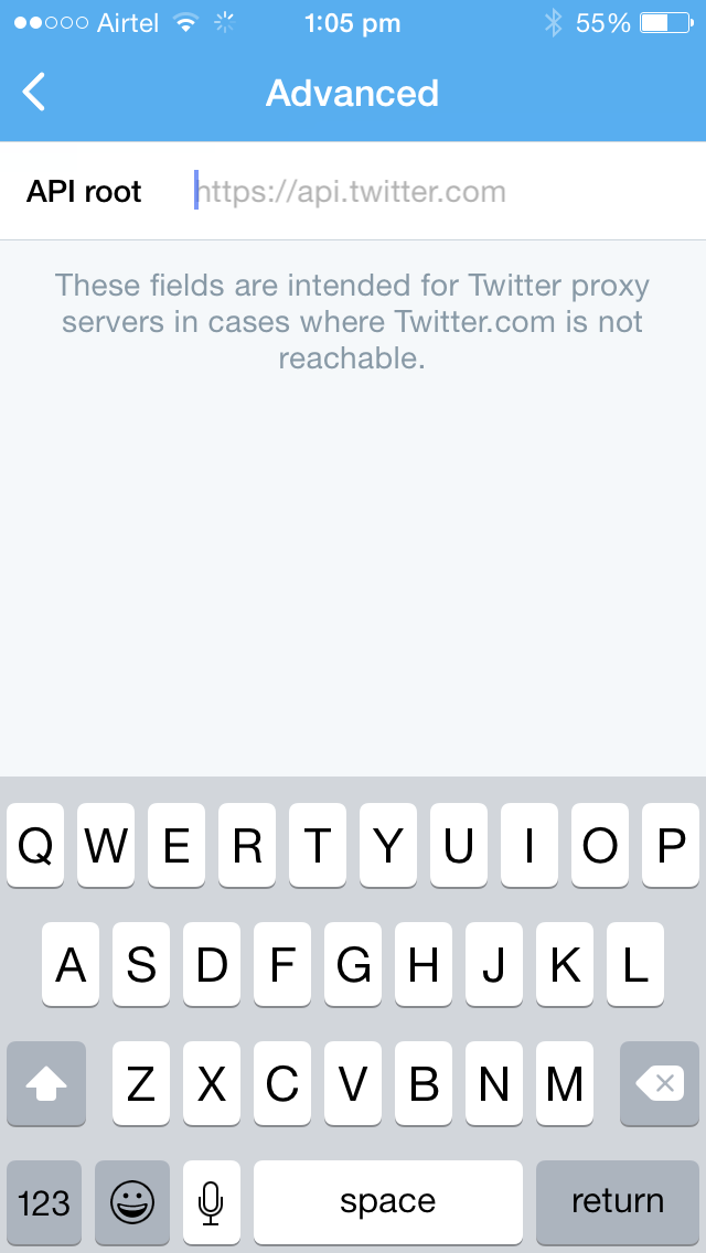
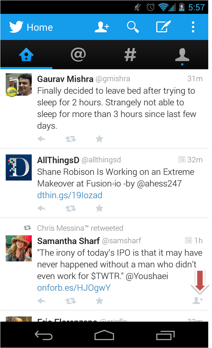
4) Twitter – Log in
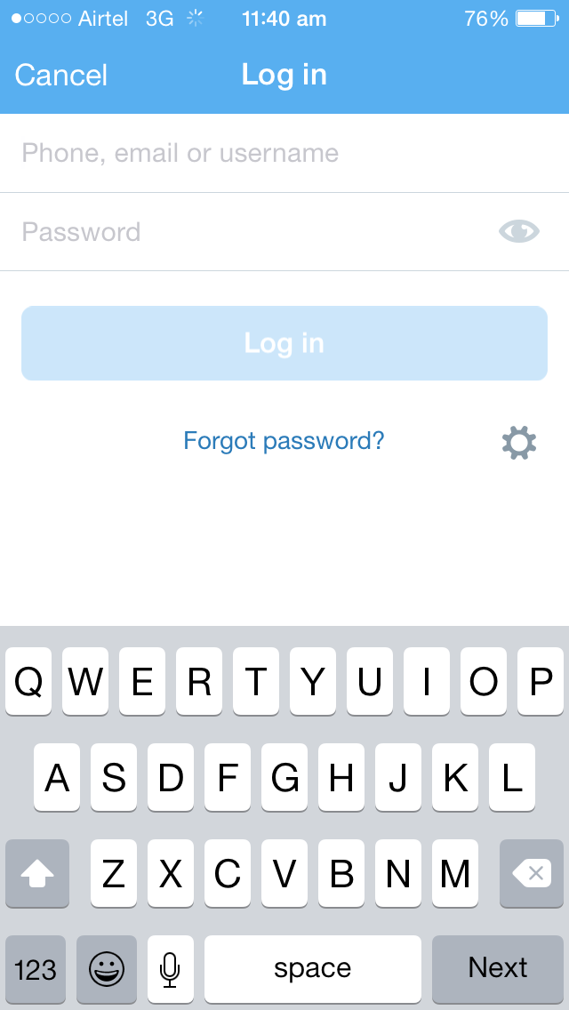
Branding: No
Minimalistic and Neat
No of buttons on page = 1, No of input fields = 2, No of links = 1
Option to see password: Yes
Very interesting: The setting icon which opens to this
5) Freecharge – Sign in
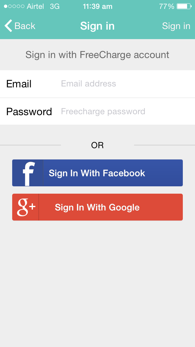
Branding: Yes
Full of options yet net
No of buttons on page = 2, No of input fields = 2, No of links = 0
User needs to click Sign in on top right or done from keyboard to proceed
Option to see password: No
Social Login Options: 2
Consistency in using “Sign in”
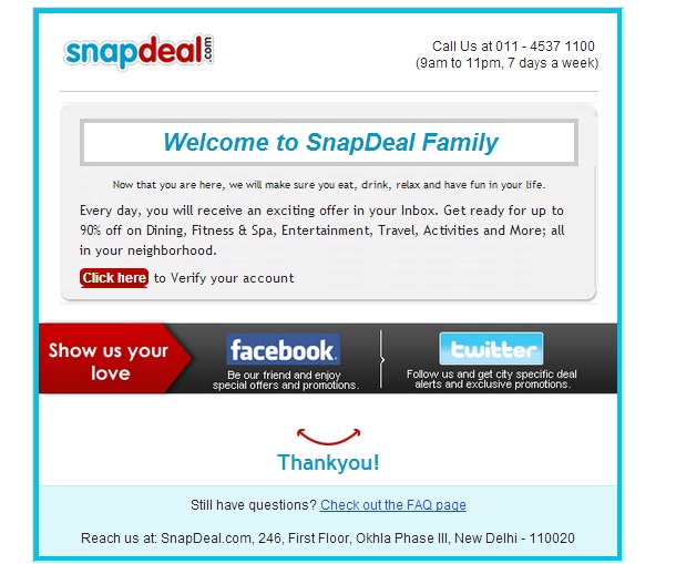
6) Snapdeal – Sign In
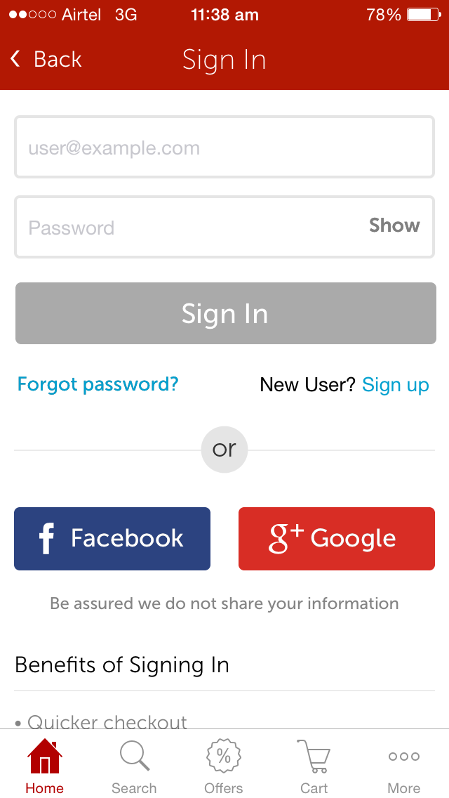
Branding: No
Brimming with options to the extent of being cluttered and heavy on the eye.
No of buttons on page = 3, No of input fields = 2, No of links = 2
Option to see password: Yes
Social Login Options: 2
The CTA for social login is just the name of social platform, curious if/how it impacts Clicks
Interesting: The page is in two folds, with second/bottom fold talking about “Benefits of Signing In”.
One wonders, is this bit a carry forward from the old days and nobody in Products team bothered to question the need for this?
Also, the presence of menu on Sign in page is conspicuous
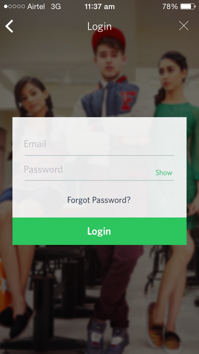
7) Jabong – Login

Branding: No
Multiple options to Login
No of buttons on page = 2, No of input fields = 2, No of links = 2
Option to see password: No
Social Login Options: 2
Interesting: Seems like Jabong prefers their users to Login using social sites over their own account on Jabong.
8) Myntra – Login
Branding: No
No nonsense Login page. Simple and beautiful
No of buttons on page = 1, No of input fields = 2, No of links = 1
Option to see password: Yes
Social Login Options: 0
Though they don’t have an option of social login but I like the simplicity of this page
9) Paytm – Sign in

Branding: Yes
Too much going on here
No of buttons on page = 3, No of input fields = 2, No of links = 3
Option to see password: Yes
Social Login Options: 2
Paytm has T&C links, while no one else does. Also, Paytm is the only app other than Twitter, that let’s you login using your mobile number.
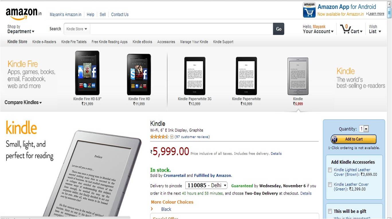
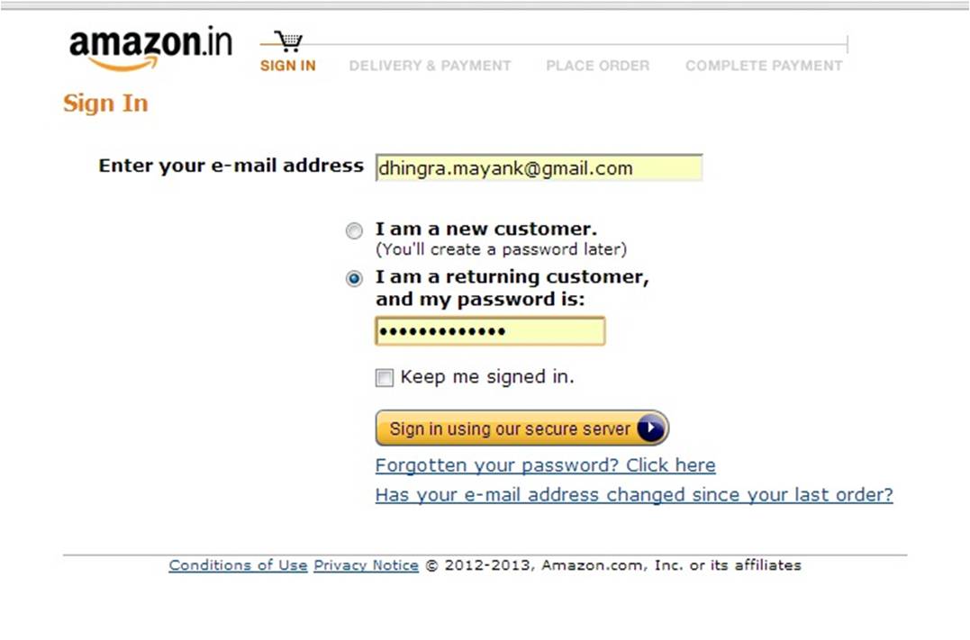
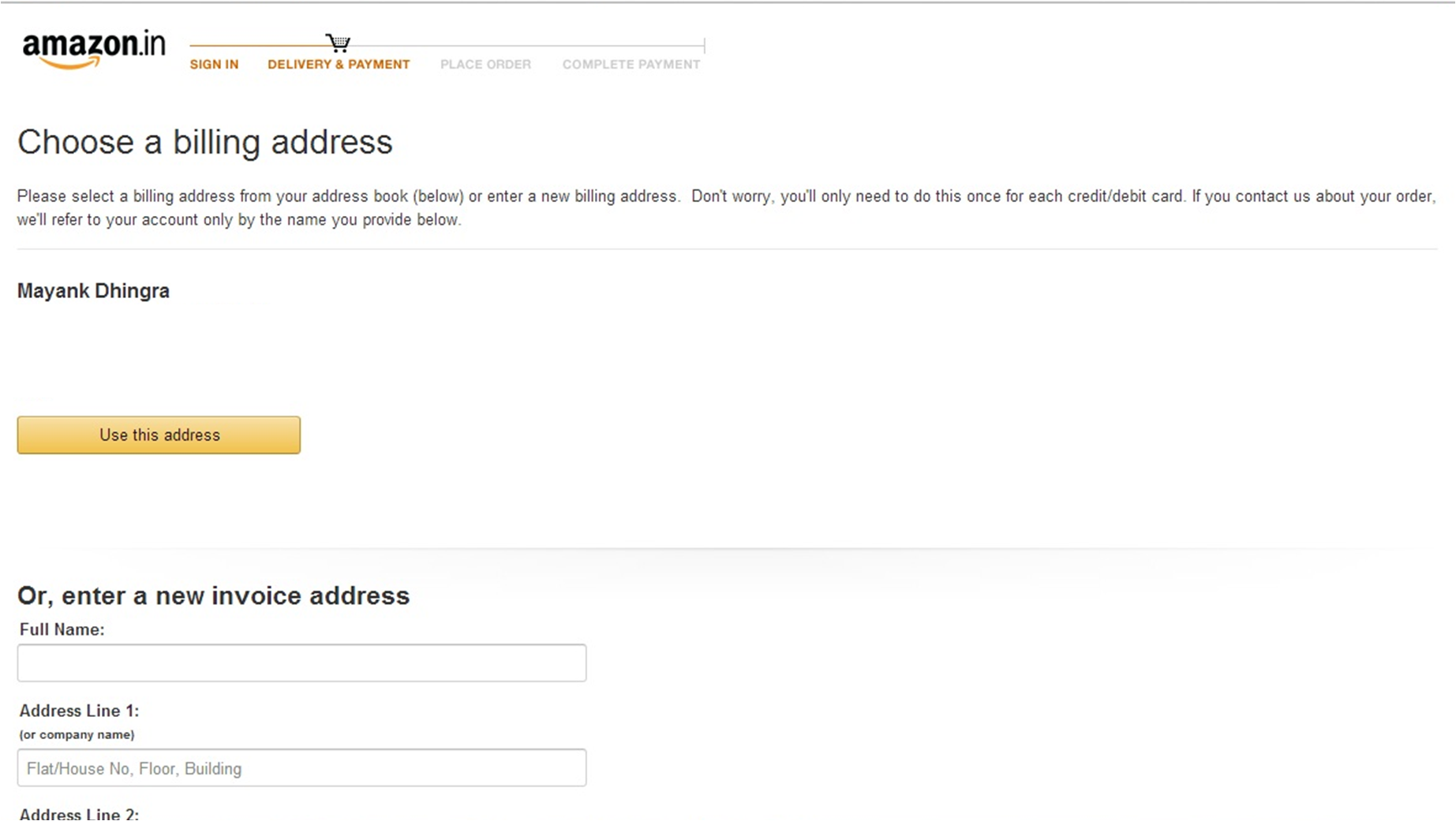
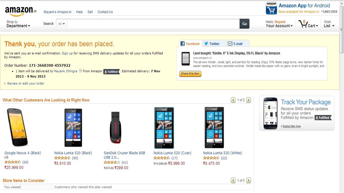
10) Amazon – Sign in
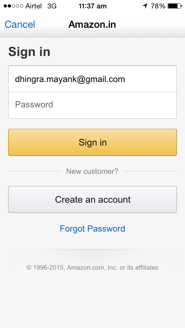
Branding: Yes
Neat and sure
No of buttons on page = 2, No of input fields = 2, No of links = 1
Option to see/hide password: No
Social Login Options: 0
The create an account on Amazon’s login page is very clear and should be helpful to New users who’ve landed at Sign in page
11) Flipkart – Login
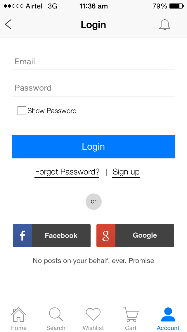
Branding: No
Well structured and neat
No of buttons on page = 3, No of input fields = 2, No of links = 2
Option to see/hide password: Yes
Social Login Options: 2
“No posts on your behalf, ever. Promise” should help in increasing the trust and making more folks using Social Login.
Menu on login page is something I am not too sure of being needed/useful. Similarly the notifications icon on top right? In what case would notifications be needed on the login page?
Which Login pages do you like/dislike most from these ?and why?


