Thoughts on Business, Marketing and Social Media
Random header image... Refresh for more!

The Design of Everyday Things: PVR’s movie schedule

If you’ve been to a PVR cinema ever you might remember their movie schedule. Here’s a screenshot for your reference (sorry for the low quality picture).

pvr cinemas movie schedule

Did you notice anything?
The listing/sub-section for PVR cinemas in South Delhi looks exactly like the subsection for West Delhi. Exactly my point.

Every time I pick up this schedule I invariably feel there’s something wrong about its design and the problem is that it’s really a pain to find out where the theatre in question(the one(s) you want to check) is located in the schedule i.e. Unless you’ve ingrained the complete  movie schedule layout in your head you will have to spend time locating the cinema of your choice (middle right or left bottom or extreme right top) and the PVR guys haven’t helped us a bit with this problem. Their approach is simple, list all the PVR theatres in NCR, categorize them according to locations, put them class wise (PVR Premiere on Top) and mass print it for each of these theatres.

While this might sound obvious(and most easy) way to go about this situation, it certainly isn’t the best (it takes some time to locate your theatre of choice) and many of you might agree that folks at PVR could do a better job at it by customizing their schedules a bit.

Wouldn’t it be nice for them to print 5-6 different schedules for various regions (North Delhi, South Delhi, Gurgaon etc) if not for all theatres and highlight the show timings for each one of them (for ex: the movie schedule for North Delhi has first/top most space for North Delhi cinema listings)?

What say?

October 3, 2009   2 Comments

Designing Notification Emails: What you can learn from Friendfeed and others

Email notifications for various actions(like new friend request, new follower) play an important role in getting a user back to the site and making them perform an action (accept/deny or follow back). Also, given the huge size of various social networks and thinking of these emails as a customer touch point it’s helpful to have a nicely designed notification email template. I’ve written a couple of posts on the same earlier too.

In this post I’ll try to compare the notification email by various popular platforms for the basic action of getting a new friend,follower, subscriber etc and see whose doing what and what could they do to make things better.
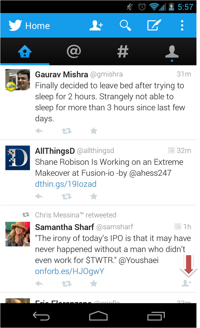
1) Twitter:

twitter new follower notification

Format: HTML; Display Pic: Included; Call to Action: Visit profile; Direct Action: Block

This template is mostly good enough to decide if a user wants to follow back another user of not but by having a direct follow button would have helped.

2) Slideshare

slideshare follow notification

Format: HTML; Display Pic: Not Included; Call to Action: Visit profileDirect Action: None

This template is plain and simple but it doesn’t have a display pic for new follower and it doesn’t have a direct button for an action. Also, it has two links which point to the same page, which isn’t the best thing .

3) LinkedIn

linkedin new request notification

Format: HTML; Display Pic: Not Included; Call to Action: View InvitationDirect Action: Accept Invitation.

While Linkedin has a direct action button they don’t have any detail about the user in question. Here again a picture or some more description will be helpful.

4) FriendFeed:

friendfeed subscriber notification

Format: HTML; Display Pic: Included; Call to Action: NoneDirect Action: Subscribe back

Friendfeed has by far the best designed email notification template in which they have the display pic, last few updates and just one link to get direct action(subscribe back) from the user

5) Facebook:

facebook new request notification

Format: HTML; Display Pic: Included; Call to Action: Visit request Direct Action: Accept Request.

Facebook has changed it’s notification from the older one (active till 14th september 09). While they have definitely gone the Friendfeed way, the name  of direct action button is Login which doesn’t kinda look right.

facebook older notification email

Format: Text; Display Pic: Not Included; Call to Action: View RequestDirect Action: None

6) Orkut:

orkur request notification

Format: HTML; Display Pic: Included; Call to Action: Visit profile and Visit friends pageDirect Action: None

Orkut too like slideshare has two links to the user’s profile and a third link which reads ‘visit friends page’ but it takes you to a separate ‘add friends’ page ala facebook.  Also there is no direct call to action here too.

While there could be reasons for not having a direct action button for Facebook and  Orkut(because they need to group friends into categories for example) some sites like Slideshare and Twitter can easily pick this.{Tip 1}

Having two links to the same profile page is definitely not wise and needs to be taken care off {Tip 2}. Other tips like having some profile info and a display picture can help {Tip 3} in a direct call to action(button etc) {Tip 4} if there is.

As you might have noticed eventually every notification email has moved to HTML format as it has more options like better looks and including a direct action call. {Tip 5}

What do you think about these email notifications?

September 20, 2009   10 Comments

Want to download a file from Scribd? Upload one – Part II

A couple months back I wrote about an interesting(weird?) feature of Scribd that asked me to upload a file in order to let me download another. I wasn’t the only one who found this ridiculous (read comments) and obviously it didn’t go down well with some of us. I happened to run into that feature (which I had almost forgot) again while trying to download one of the featured documents from the site. Here’s what I got after clicking the download link

scribd_presentations need an audience

Oh, so instead of a boring textual message we now have a graphic trying to convince us that in the benefit of community we should upload more presentations. I like most other users(presummably) on the internet didn’t let this deviate it from the goal I started with and clicked “Maybe Later” but folks at Scribd were equally adamant in not letting anyone download something from their servers without getting anything in return (who needs Attention, Engagement etc?) so I got this

scribd_subscribe or continue to download

Right, So if I am not uploading a file I might as well follow(or subscribe) to some people which Scribd feels match my needs(or their’s ?). For a second I can understand the upload presentations prompt, but prompting users to SUBSCRIBE to other users when all they really want is to download a goddamn presentation ?

O Scribd, what were you thinking ?

Apparently there’s another graphic that one gets to see while attempting to download a presentation

scribd_giving back to the community

Thankfully unlike last time Scribd has not only made it optional(maybe later) to upload a presentation before getting to download, they also tell you that you won’t be prompted to upload once you’ve uploaded two presentations or more.

scribd dont worry

(Footer of those upload prompts)

As mentioned in last post I don’t think that forcing users like this works well. Not only does it irritates users it also leads(or might lead) to people submitting random garbage just to get around the needless hurdles like these.

What do you think about these prompts?

Is there a win-win solution for such situations (for both site owners and users) ?

August 29, 2009   5 Comments

Twitter Search: No Looking Back ?

Have a look at the Twitter search result page below.

twitter search result page

Can you see something missing ?

Ever since we had search.twitter.com ( I think after the summize acquisition) I’ve always wondered how come there isn’t a link to go back to the Twitter home page from the search result page. Though it makes PERFECT sense that there should be a visible link to the main page on the top section of the result page or at least the Twitter logo should redirect to the main page , none of them exists.

Instead they have a inconscpicous little “Twitter Home” link at the page footer which I bet would be hardly used.

twitter home link on page bottom

Thinking aloud, could it be that ever since Twitter acquired Summize they never really thought of putting the Twitter homepage link which was missing in Summize(it didn’t need a home page link as it was just a search tool and search can be done the search result page too).

For those of you who joined the Social Media bandwagon late, here’s what  Summize looked like.


summize (Image credits http://www.flickr.com/photos/toprankblog/)

familiar to the F? :)

What do you think about this, a missing chunk of usability resulting from oversight or something else ?

July 31, 2009   3 Comments

web 2.0 Expo Europe 2008

web 2.0 Expo Europe was held in Berlin from 21st to 23rd October. Here’s the pack of presentations from the expo.

You can read more about the expo here.The videos from the expo haven’t been uploaded yet.

October 26, 2008   No Comments