Despite all the jig bang the Indian cyber space has kinda been hostile to the incumbents of online dating ecosystem. Dating as a concept is yet to catch up here but some of the newly launched mobile apps seemed determined to change that.
Thrill, is one such new dating app on the block ( H/T @pacificleo). Android based and targeted for Indian users.

Founded in Nov 2012 in Singapore by Josh Israel and Devin Serago. The USP of the app is that on Thrill, women have the absolute power to decide which guys to accept and reject.”He applies. She decides” goes the tagline
Apparently women in a man’s network have to approve for him to be able to join. Not sure, how it is actually implemented though
Let’s check out the app
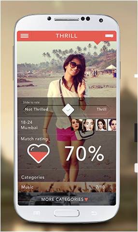
1) Welcome Screen

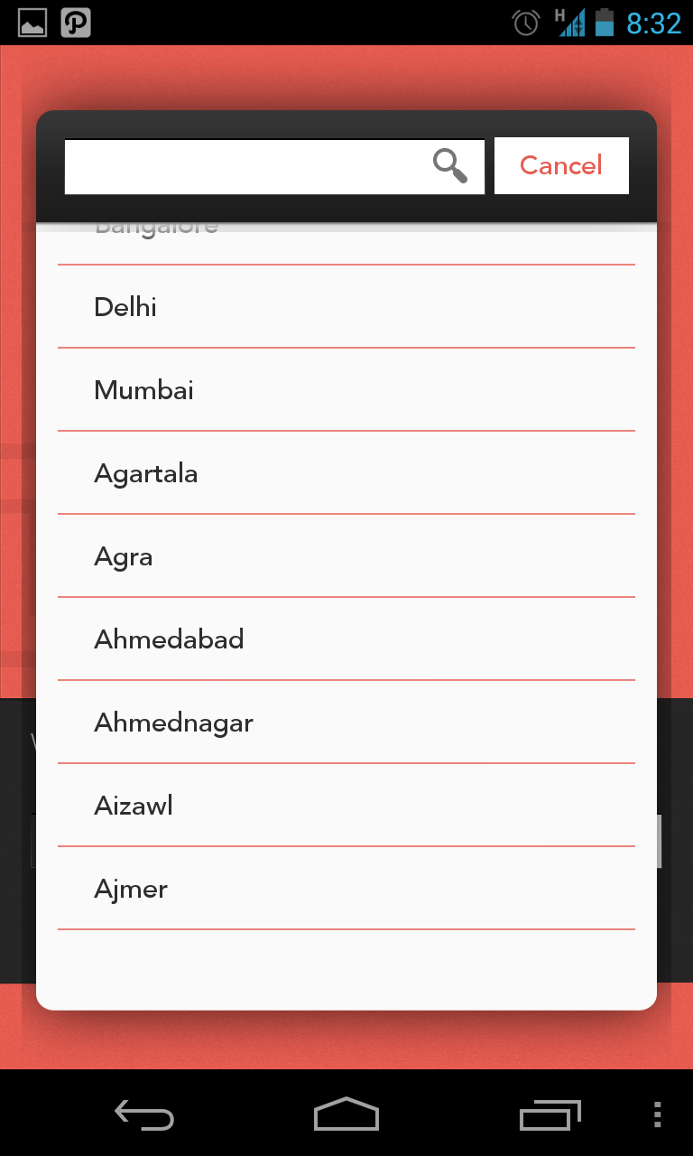
2) Choose Location
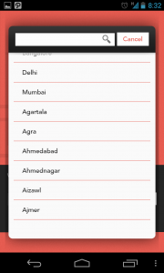
The metros figure up on top of the list followed by other cities arranged alphabetically. Good thing
3) Apply & Wait

Thrill isn’t an open platform (at least it wasn’t when I used it for the first time last month). You apparently are placed in a queue to verify your profile and make it look exclusive. A social share in hopes of moving up the queue is a bonus. I didn’t share socially but got an approval in a day or so
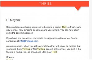
We will only connect you both if the feeling is mutual
4) Gender Selection, Sign up and Social profile Access
a) 
b) 
c)

Three screens to select gender, choose sign up via social profile and then grant access is an overkill.
Possible Alternatives:
Show screen 4b) first and add profile access disclaimer there itself. Ask for gender only if the user hasn’t filled in their gender in their profile.
Also, WHO/WHY would anybody sign in with their Linkedin Profile on a dating app? I’d be really interested in knowing what % of signups happen through linkedin. (Use Twitter or Google instead)
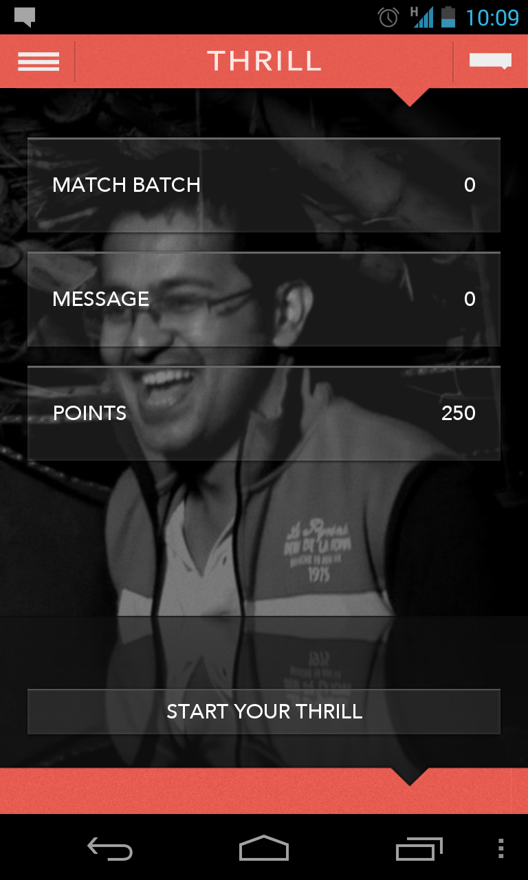
5) Dashboard

Comments: As a first time user, I have no clue what a “Match Batch” is and what’s the deal with “Points”. Anyways, I’d click “Start Your Thrill” as the call to action is quite powerful.
6) Starting Thrill
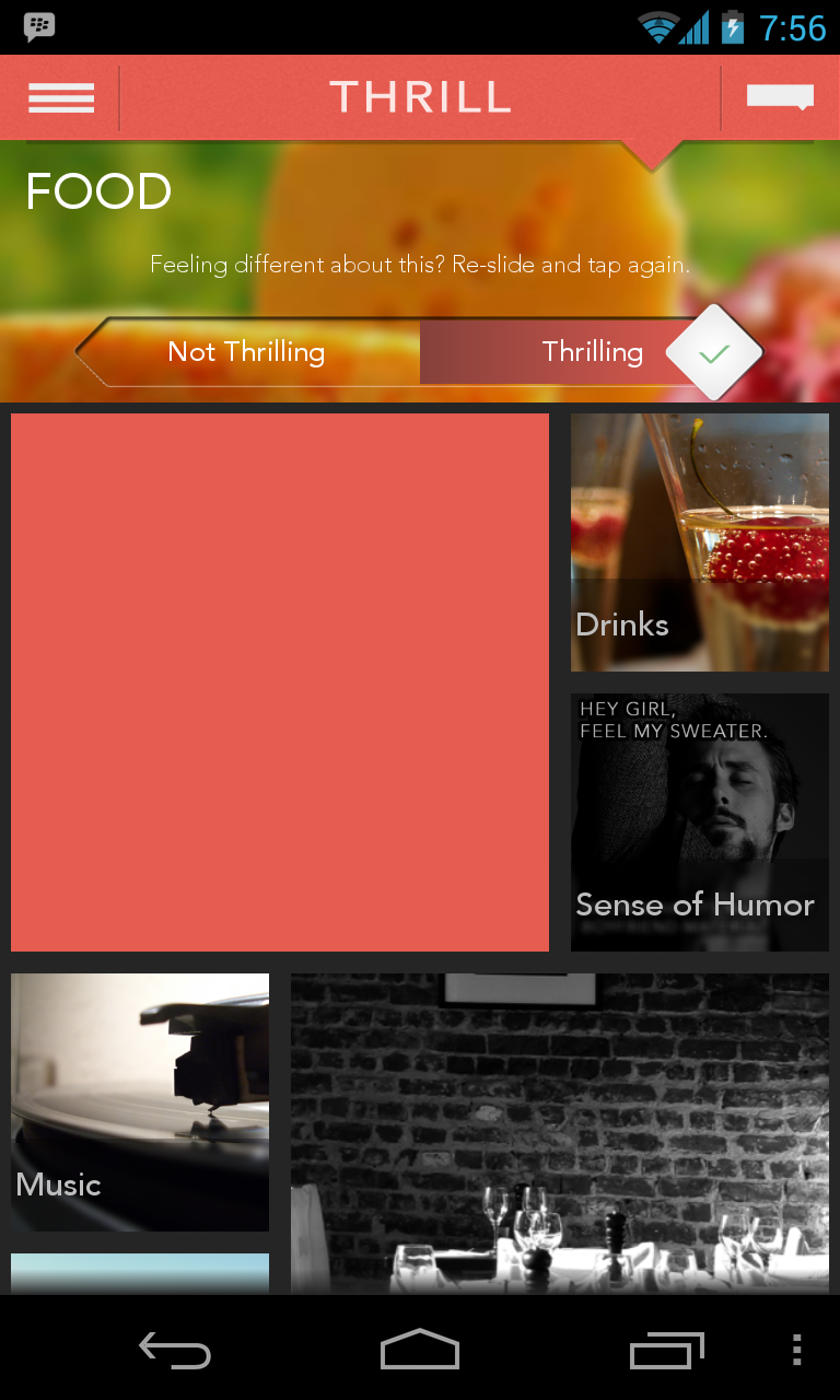
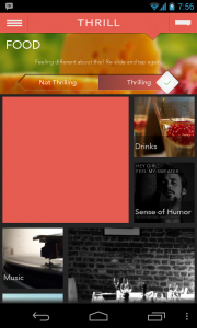
a) Select Category

Comments: This screen isn’t that intuitive, some overlays would help a newbie figure out how to go ahead.
b) Rate Category
Rating a category bit didn’t seem needed and also added an unnecessary extra step in the flow
c) Rate Item
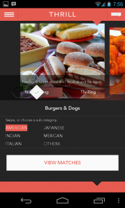
After rating a few items you get an option to view matches.
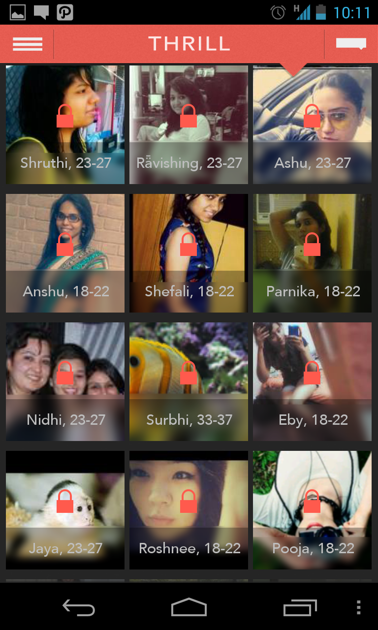
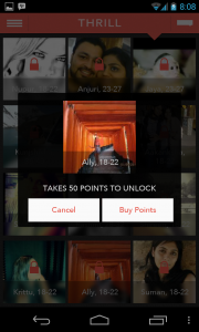
7) See Matches


Based on how you rated various items you are presented an unlock batch of matches, you can unlock some of them initially by shaking your phone or eventually by buying credits (Freemium mode #goodone)

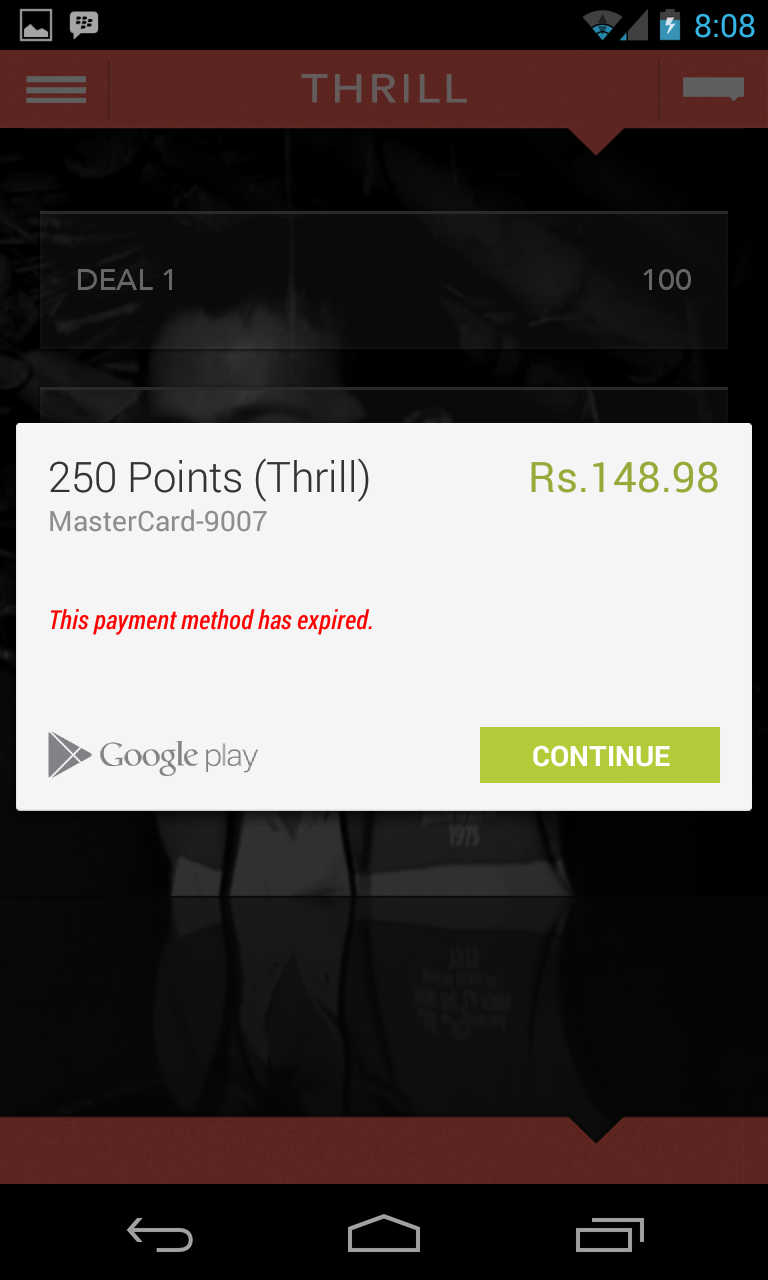
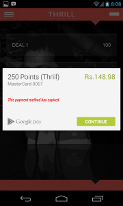
This page where the user is supposed to choose how many points do they want to purchase isn’t quite clear. I am not sure if Deal 3 is for 500 points or 500 Rs. Also, some help on how much is 1 point for, and a few basic FAQs in form of a link etc would be of appreciated.
Phew !!
Overall the app seems to be very neatly designed(UI and UX), is fairly fast and has an interesting take on dating. The concept of rating various categories and items in them to be able to find a matching profile is fairly intuitive.
Initially it had some bugs (app freezing or crashing during certain events) which were fixed in subsequent updates.
I haven’t used dating apps so don’t really know what the ideal/expected scenario is. Do users keep using the app actively or they find a match or two and leave?
Apart from the extended workflows required for certain actions I am apprehensive on how would they solve the
- Should the part of rating be one time during on-boarding or a regular affair? For example if have I rated all food items, is it done or after some time there will be new items which I’d be required to rate to be able to find new set of matches? Perhaps the core experience could be made simpler and an easy win given to the user
- Chicken and Egg problem : Despite giving the app a spin for a few weeks, the overall user base didn’t seem to be increasing much. There is no way to know if more and more women are joining the app. I think unless this is the case or you find a match early one, I am not too sure why would someone keep coming back to the app.
Customer On boarding- 3/5
Engagement -2/5
Look and Feel – 4/5
Overall Rating: 3.5/5


![[Guruslodge.com]Things-Fall-Apart](http://mayank.name/wp-content/uploads/2013/11/wouldyoulike.jpg)